BigBurgh.com Broke the Mold For Homeless Apps
. . . in Pittsburgh and Louisville, and coming soon to two more cities
It started with the Pittsburgh Bureau of Police: cops on the beat didn’t know where to turn when coming upon street homeless in need. Where was the nearest shelter? The nearest meal, the nearest help for chronic medical conditions, the nearest source for clothes or toiletries? With hundreds of always-changing options, it was all too confusing. And they had no ready way to connect homeless with a professional who could begin a full, case-managed solution.
The Deputy Chief of Police asked, “Could there be app for that?”
Four years ago, the City’s Foundation community responded with a resounding yes, and asked Informing Design to come up with an app that would work not just for the Police, but for professionals and bystanders and yes, even the homeless themselves.
It took nearly a year of research and design. Bob Firth, Informing Design’s head, found most current homeless apps were either slow or cumbersome or both. And many appeared to have content that was woefully out of date. He was told in no uncertain terms that Police were only going to use an app that was effortless, and that gave them relevant, up-to-date information in an instant. Two wrong answers, and that would be the end of the app.
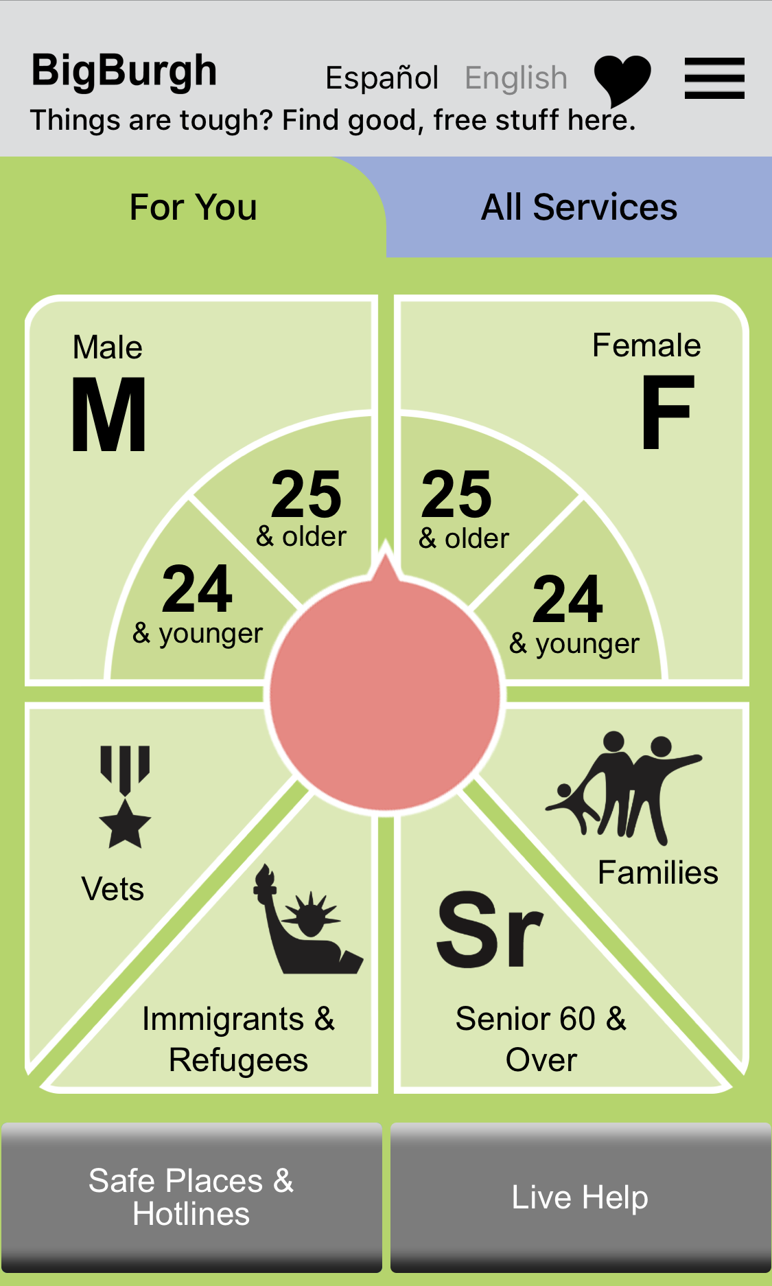
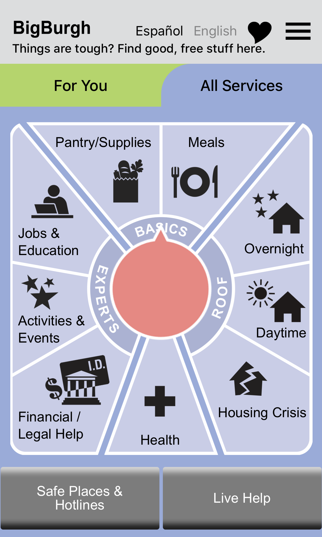
So what did Bob come up with? Spinning dials in the cloud. And a model for continuous agency engagement on the ground.
5,000 BigBurgh business cards are printed each month and distributed to libraries, agencies, and professionals.
1. Unprecedented Levels of Usage
After three years in Pittsburgh, and just one in Louisville, the BigBurgh platform has generated continuous usage at an unheard-of level for social service apps. They are getting several times the usage (on a per capita basis) of the famed askizzy app for Australia. What’s the secret? Bob believes there are two necessary elements: an inviting and fast-acting interface and information that is absolutely, positively up to date. BigBurgh established a model for continuous agency engagement, both to keep the app current AND to keep agencies involved as serious stakeholders. A few days of phone calls by volunteers every quarter or so is way cheaper, but apps that have relied on that kind of updating have seen steep drop-offs in usage. There are no tech shortcuts to relevance. (Bob estimates the need for 1 FTE staff per million population served.)
2. Breakthrough “Live Help” Button
One of the first design decisions was to create panic buttons at the bottom of the app. People in crisis should not be asked to wade through menus. The first of these buttons reinvented how to link the street to outreach professionals: mass email. The Police, a bystander, or the homeless themselves can press the button and send an email to all outreach professionals at once. The first to respond “replies all,” effortlessly alerting all the other professionals that someone is on the case. The system takes care of itself: no central operator, no coordination of any kind is required. In Pittsburgh, response times (12 hours per day, 6 days per week) have been 20 minutes or less. First aid, water, clothing, or personal, professional guidance to needed services arrives within a couple hours. Police can quickly move on with the knowledge that a situation is under control.
3. Hotline/Safe Place Panic Button Always at the Ready
The other button is for hotlines and safe places: for victims of rape or domestic abuse, for veterans in trouble, for those in mental health crisis, for sex-trafficking victims, for LGBT safe places. In Pittsburgh and Louisville, this button is used hundreds of times per month.
4. Cloud-Service-Simple to Get Going
It couldn’t be easier for a City to get going with a BigBurgh (in Louisville, it’s LouieConnect.com). The app lives in the cloud, and is operated by each city with a very simple web-site dashboard. Informing Design handles all the tech behind the scenes. Note that the app is “just” a web site (called a web-app), but it looks and feels just like an app on the smartphone screen. (App stores seemingly requiring credit cards even for free apps can be too much of a barrier.)
Because it is based on the latest software frameworks and Google’s database system in the cloud (Firebase), the web-app is fast and responsive. Moreover, each city gets its own analytics dashboard that tracks usage by service, type of user and by hour, day, week and month. Setting up a city or even an entire state can be done in a matter of weeks, and the cost is affordable given that most of the software framework is ready to go.
To get started, call or email Bob Firth:
412-465-0047
bob@informingdesign.com
“I love talking about how we brought BigBurgh to Louisville and how we are using it for the benefit of our entire community. Bob was wonderful to modify BigBurgh to meet our needs and highly responsive to our feedback and input.””
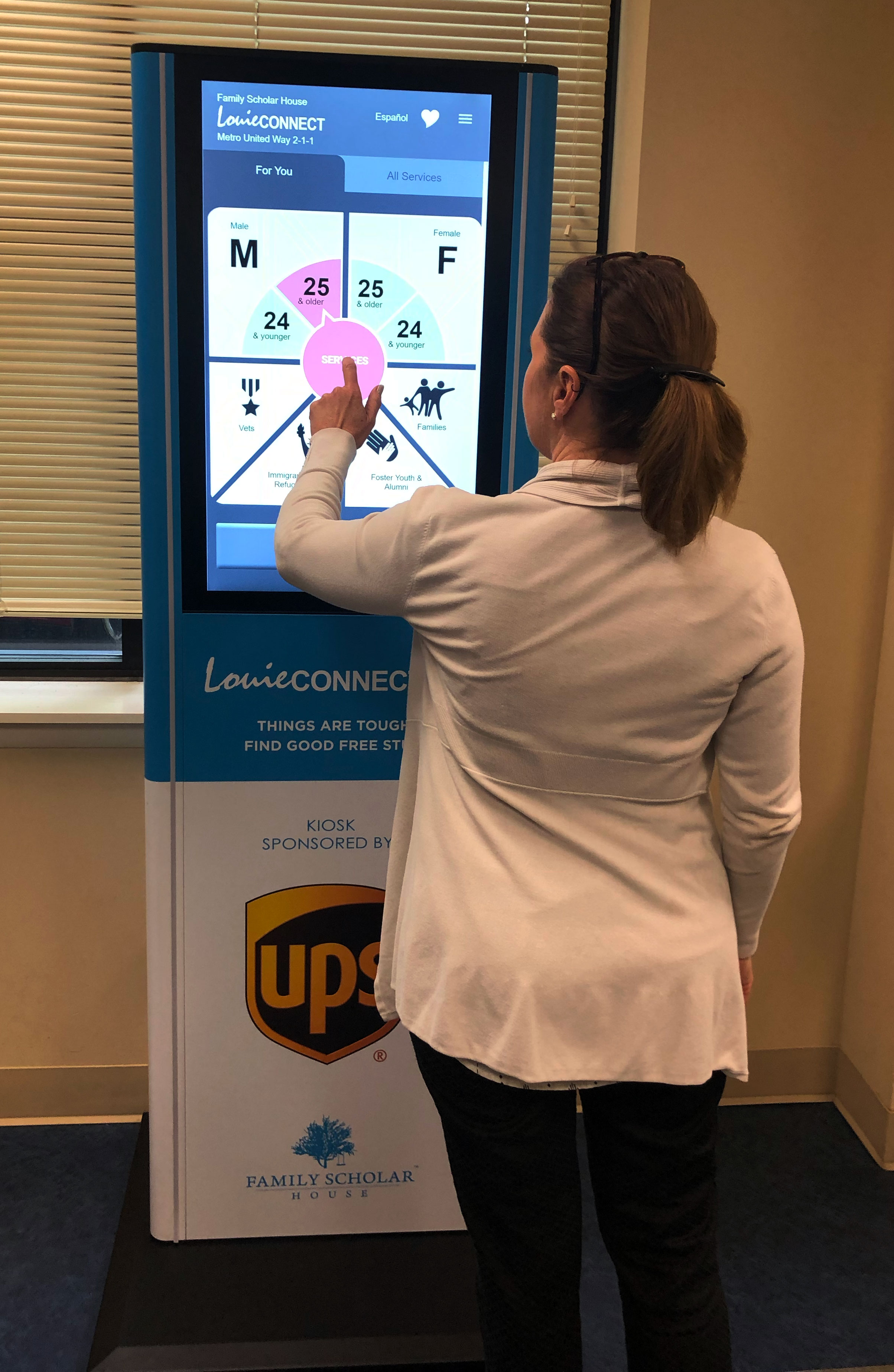
One of seven kiosks being deployed in Louisville.


